

Many homeowners overlook the transformative power of paint to instantly refresh their space. You can make your home feel cleaner and brighter by choosing light, reflective colors and clean finishes. A well-chosen palette creates an inviting atmosphere and even makes rooms appear larger. The right paint job is one of the most cost-effective upgrades with immediate visual impact.
Selecting Colors to Enhance Brightness
Lighter paint colors naturally make rooms feel more open and airy. Choosing shades with high Light Reflectance Value (LRV) increases natural light dispersion, making spaces appear larger and more welcoming. Cool neutrals like soft whites and pale grays often work best. Knowing your room’s lighting conditions helps you pick hues that amplify brightness without feeling sterile.
Factors for evaluating Light Reflectance Value
Room orientation, natural light exposure, and artificial lighting all influence how LRV performs on your walls. Higher LRV numbers mean more light reflection-aim for values above 70 in dim spaces. Surface finish also affects perceived brightness. Knowing how these elements interact ensures your color choice enhances illumination effectively.
- LRV measures how much light a color reflects
- North-facing rooms benefit from higher LRV paints
- Flat finishes absorb light; satin or eggshell enhance brightness
- Artificial lighting can mute or exaggerate LRV
How to identify clean versus muddy undertones
Clean undertones align clearly with their base color family-blue-based whites stay crisp, while muddy ones shift unpredictably. Hold a paint swatch next to a pure white card; if it pulls pink, green, or yellow under different lights, it’s likely muddy. Knowing how undertones behave prevents unwanted color clashes in your space.
Paint colors with muddy undertones often contain multiple conflicting pigments, causing them to look dull or dirty in certain lighting. Clean undertones maintain clarity and consistency, enhancing a room’s freshness. Test swatches on large sections of wall and observe them at various times of day. Knowing which undertones support your lighting and décor ensures a polished, cohesive look.
Choosing Finishes for a Luminous Glow
Selecting the right paint finish transforms how light moves through your space. A well-chosen sheen enhances natural and artificial light, making rooms feel airier and more open. You want surfaces that reflect brightness without drawing attention to imperfections. The finish you pick impacts both mood and maintenance, so balance aesthetics with practicality for lasting appeal.
Comparing sheen levels for maximum light bounce
Different sheens reflect light in unique ways, directly affecting a room’s perceived brightness. Matching the right level to each area ensures both beauty and function.
| Sheen Level | Light Reflection & Best Use |
|---|---|
| Flat/Matte | Low reflection; ideal for ceilings and low-traffic areas |
| Eggshell | Soft glow; great for living rooms and bedrooms |
| Satin | Moderate shine; suits hallways, kitchens, and kids’ rooms |
| Semi-Gloss | High reflection; perfect for trim, cabinets, and moisture-prone zones |
| Gloss | Maximum shine; used for doors and accent pieces |
Tips for selecting durable, easy-to-clean finishes
Think about how each room is used when choosing a finish. High-traffic areas benefit from satin or semi-gloss paints that resist scuffs and wipe clean easily. Bathrooms and kitchens need moisture-resistant options to prevent mold. Children’s rooms demand washable surfaces. This ensures your walls stay fresh with minimal effort.
- Opt for satin in family rooms and stairwells
- Use semi-gloss in kitchens and bathrooms
- Choose scrubbable formulas for homes with kids or pets
- Pick low-VOC options for healthier indoor air
Every room faces different wear, so matching durability to lifestyle matters. Satin finishes offer a soft luster while standing up to regular cleaning, making them a smart pick for busy areas. Semi-gloss not only resists humidity and grease but also enhances light, adding brightness to dim corners. Even in low-light spaces, a slightly reflective, stain-resistant finish keeps walls looking crisp. This makes maintenance effortless and preserves your home’s inviting glow.
- Look for stain-resistant technology in family zones
- Test cleanability by swiping with a damp cloth
- Balance sheen with wall condition-higher gloss reveals flaws
- Consider acrylic-based paints for flexibility and washability
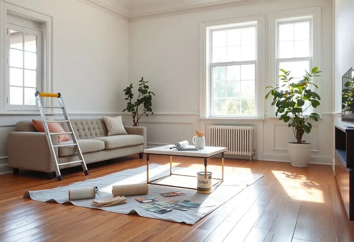
How to Prepare Surfaces for a Professional Look
Proper prep work ensures your paint adheres smoothly and lasts longer. Skipping these steps risks a patchy, uneven finish that undermines your effort. You’ll want clean, smooth surfaces to achieve that polished result you’re after.
Essential cleaning and priming steps
Start by washing walls with a mild detergent to remove dust and grease, especially in kitchens and hallways. Let surfaces dry completely before applying a high-quality primer. Priming seals porous spots and blocks stains, creating a uniform base that enhances paint coverage and color accuracy.
Techniques for repairing imperfections before painting
Fill cracks and holes with spackling compound using a putty knife, then sand smooth once dry. Even small dents or nail holes can catch light and ruin the finish. Address peeling paint by scraping loose edges and feathering the surrounding area.
For deeper dents or larger gaps, apply joint compound in thin layers, allowing each to dry before adding the next. Sand lightly between coats for a seamless blend. Properly repaired surfaces prevent future cracking and deliver a flawless, professional-grade result. Always inspect under angled light to spot flaws before painting.
Strategic Tips for Making Spaces More Inviting
Choose light, reflective colors to enhance natural light and make rooms feel larger. Use consistent color palettes across connected spaces to create flow. Add warm accent walls in key areas to introduce coziness. Knowing how color impacts mood and space transforms your home into a welcoming retreat.
- Light, reflective colors amplify brightness and openness
- Consistent palettes create visual harmony between rooms
- Warm accent walls add depth without closing in space
- Ceiling and trim paint can dramatically alter room perception
Using warm accents to balance bright neutrals
Pair crisp whites or soft grays with warm accent tones like terracotta, mustard, or deep sage on a single wall or in decor. These touches prevent sterile vibes and add human warmth. Knowing how to layer color keeps your space feeling lively and grounded.
How to paint ceilings and trim to open up rooms
Painting ceilings in lighter shades than walls lifts the room visually, making it feel taller. Use white or near-white trim to define edges without heaviness. This contrast draws the eye upward and enhances natural light. Knowing how vertical perception works gives you control over a room’s feel.
Extending light-colored paint to the ceiling reduces visual weight, especially in low-ceilinged rooms. When trim is painted the same soft white as the ceiling, corners appear less confined and space flows more freely. Using semi-gloss finishes on trim increases light reflection, subtly brightening the entire area. This technique works best when wall colors are kept a few shades darker for contrast. Knowing how light interacts with color and finish helps you shape space with precision.
Incorporating Lighting to Complement Your Paint
Light transforms how paint appears on your walls, shaping the mood and perception of space. The right lighting reveals the true depth of your chosen color, enhancing warmth or brightness as needed. Natural and artificial light interact uniquely with finishes and pigments. After considering both sources, your rooms will feel more balanced and alive.
How to coordinate paint with natural light sources
South-facing rooms receive strong, consistent sunlight, making cool tones like soft blues or greys appear brighter and more balanced. North-facing spaces get cooler, diffused light, so warm hues like creamy whites or warm beiges help counteract shadows. East and west exposures change throughout the day, affecting color perception. After testing swatches at different times, you’ll see how light shifts your palette.
Tips for choosing artificial bulbs that enhance color
- Select bulbs with a color temperature that matches your paint’s undertones
- Use warm white (2700K-3000K) to enhance beige, cream, or terracotta shades
- Opt for daylight bulbs (5000K-6500K) in task areas to keep cool grays and whites crisp
- Dimmable LEDs offer flexibility to shift ambiance based on time or mood
Lighting choices directly affect how rich or flat your paint looks. A warm bulb can deepen a pale yellow into a sun-kissed glow, while a cool LED might wash out a soft blush tone. The finish of your wall-matte, eggshell, or satin-also reacts differently under various bulbs. After aligning bulb temperature with your paint, the space will feel cohesive and intentional.
Factors for Maintaining a Fresh Aesthetic
Consistency in color harmony, use of high-quality paint, and proper lighting enhance long-term appeal. Protect surfaces with washable finishes and minimize sun exposure. Clean walls regularly and address scuffs early. After choosing durable materials and thoughtful placement, your space stays vibrant with less effort. This supports a lasting, inviting atmosphere.
- Preserve color harmony across rooms
- Use washable paint in high-traffic areas
- Install lighting that enhances paint brightness
- Limit UV exposure to prevent color fading
How to protect paint from fading and wear
Direct sunlight and humidity accelerate paint deterioration. Install UV-blocking window film and use exhaust fans in moist areas. Choose exterior-grade paint for sun-exposed walls. After applying a protective topcoat, your walls resist fading and maintain their fresh look longer. This is especially effective in south-facing rooms.
- Apply UV-resistant coatings on sunny walls
- Use exterior-grade paint indoors near windows
- Control humidity with ventilation systems
- Install sheer curtains to diffuse harsh light
Tips for quick touch-ups and cleaning
Keep leftover paint in labeled, airtight containers for easy access. Use a small brush for scuff repairs and match the finish-matte, satin, or gloss. Wipe stains gently with a damp cloth and mild soap. This ensures spotless walls without damaging the surface. Always test cleaners in hidden areas first.
- Store paint with batch numbers noted
- Use touch-up brushes for precision
- Clean with mild, non-abrasive solutions
- Match sheen levels exactly
Small maintenance habits prevent larger problems over time. Spot-clean spills immediately to stop stains from setting. For touch-ups, lightly sand the area and apply thin, even coats. Keep a small kit with brush, cloth, and paint in a closet. This makes repairs fast and invisible. Regular care preserves your walls’ fresh appearance and extends the life of your paint job.
- Address scuffs within 48 hours
- Use fine-grit sandpaper before touch-ups
- Apply paint in thin layers to avoid buildup
- Store touch-up supplies in a dedicated cleaning caddy
To wrap up
Now you know how paint transforms your space. A fresh coat in light, warm tones opens rooms and lifts moods. Clean walls, well-chosen colors, and quality finishes make your home feel cared for and welcoming. You control the atmosphere with every brushstroke-choose wisely and live comfortably.
FAQ
Q: What paint colors make a small room feel larger and brighter?
A: Light, cool-toned colors like soft whites, pale grays, and light blues reflect more natural light and create the illusion of space. A crisp white with warm undertones works well in rooms with little sunlight, while a cool gray can add subtle depth without making the space feel closed in. Avoid dark or saturated shades in small areas, as they absorb light and can make walls feel closer. Sheer or satin finishes also help bounce light around, enhancing the airy effect.
Q: How can paint improve the mood and atmosphere of a home?
A: Paint directly influences how a space feels by affecting light, temperature, and emotional tone. Warm neutrals like beige, greige, or soft terracotta create a cozy, welcoming environment in living rooms or entryways. Cooler tones such as sage green or lavender in bedrooms promote calm and relaxation. Even a single accent wall in a cheerful hue like buttery yellow or soft coral can lift the spirit of a room without overwhelming it. The key is choosing shades that align with how you use each space.
Q: What are the best paint finishes for making walls look cleaner and easier to maintain?
A: Smooth, washable finishes like satin or semi-gloss keep walls looking fresh longer, especially in high-traffic areas. Satin works well in hallways, kitchens, and bathrooms because it resists moisture and wipes clean with a damp cloth. Flat or matte finishes hide imperfections but are harder to clean, making them better for low-traffic spaces like formal living rooms or ceilings. For a clean, modern look, choose a uniform finish throughout open-concept areas to create visual continuity and reduce visual clutter.